Margaret Calvert:

Margaret Calvert is a South-African born, British Graphic designer and typography. Calvert is born in 1936 in South Africa and spent her earliest years in Africa. When she was 14, her family moved to England and in 1950, she started studying at the Chelsea College of Arts. She took a 4 years course in illustration, Calvert has extraordinary skills in the illustration which impressed most of her tutors at the college although she was not fond of the subject she was studying as illustration. Her inspiration was to be a designer but there was no graphic design course as the graphic designing was not introduced yet at that time.
While she was studying illustration, she also studied commercial art as part of the course where they were instructed to simply concentrate on just the idea not to incorporate the typography or lettering while designing a poster. (“Margaret Calvert | Design Indaba”, 2019) After sometime Jock Kinnear, an outstanding graphic designer mentored Calvert which really helped her in flourishing and developing her skills in graphic design.
Jock Kinnear received an inspiring and prestigious project to design the signs for Gatwick airport. Calvert was requested to assistant Kinnear is his project. She developed considerable interest in lettering while she was working at Kinnear office in Knightsbridge. Working under Kinnear supervision and being commissioned by different clients such as Milk Marketing Board and P&O really helped her in sharpening her skills in depth. The Anderson Committee commissioned their firm to design a road sign system for the new motorways. The brief was to design the signs for driver’s guidance to deliver consise information that can be read while driving at a speed.

While working on this project with Kinnear, they came up with a typeface, transport that showed both upper and lower-case sans-serif lettering. The road signs were placed on the Preston Bypass for testing, in 1958. Afterwards, the British government formed the Worboys Committee. Sir Walter Worboys was designated the chairman of the committee who was assigned the task of reviewing the entire network of road signs throughout Britain. Their firm had been renamed as Kinneir Calvert and Associates by the time the review committee produced the report and put it into effect. (“Margaret Calvert | Design Indaba”, 2019) Calvert also designed easy to read pictograms based on the existing road warning signs including the signs for “men at work”, “farm animals”, and “schoolchildren nearby”.

Calvert also developed commercial fonts for mono type. In 1980, she developed ‘eponymous Calvert font’ for use on the Tyne and Wear Metro system. She was awarded an Honorary Fellowship by the University of the Arts London in 2004, and has a Senior Fellowship from the Royal College of Art. (“Margaret Calvert | Design Indaba”, 2019)


Questionnaire:

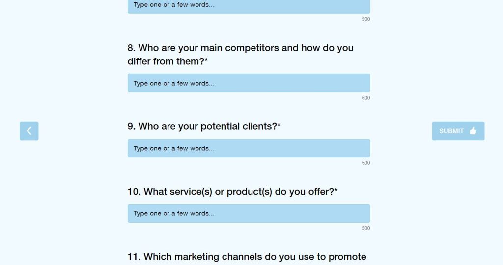
ONLINE SURVEY LINK:
https://www.survio.com/survey/d/U7L1G7L9B4E4Y4W4Q

PRINTMAKING:
MONO PRINT MAKING:
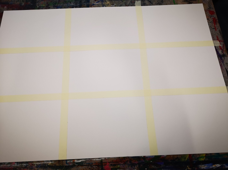
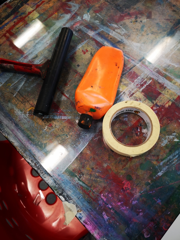
- I started with a sheet of paper, carefully dividing the sections of the page into 9 sections equally by using masking tape as a ruler.
- By using paintbrush and paint in the first step, created the texture of my choice.
- In the second section, used paint but with mixing water together and created pattern but this time the paint was mixed with water which gives the textures more refined corners and fluidity.
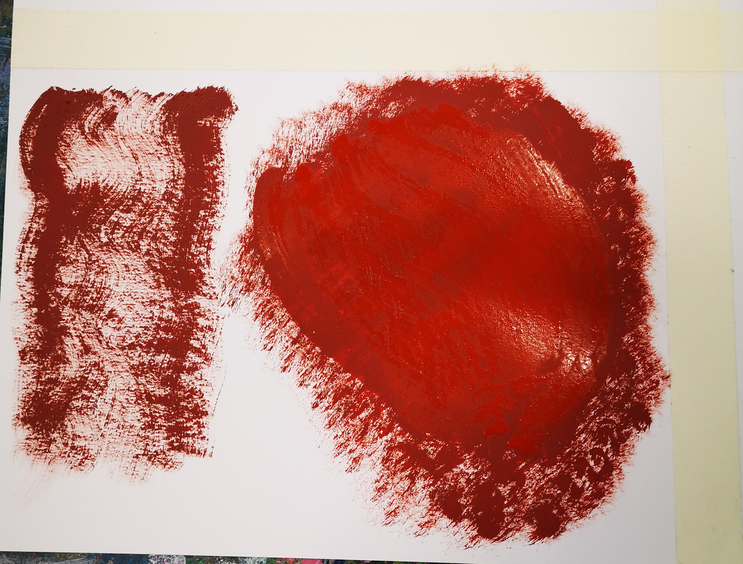
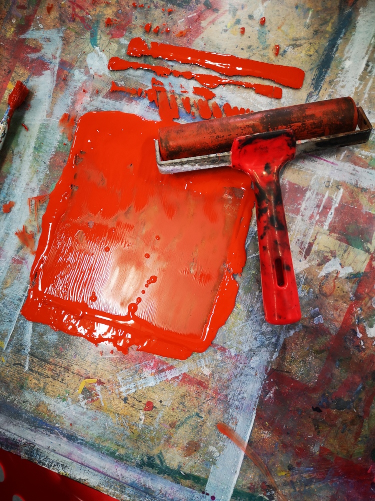
- In the third section, I used a brayer with paint and created texture which gives darker and lighter textures and more detail, the texture I created was creating layers on top of the textured layer.
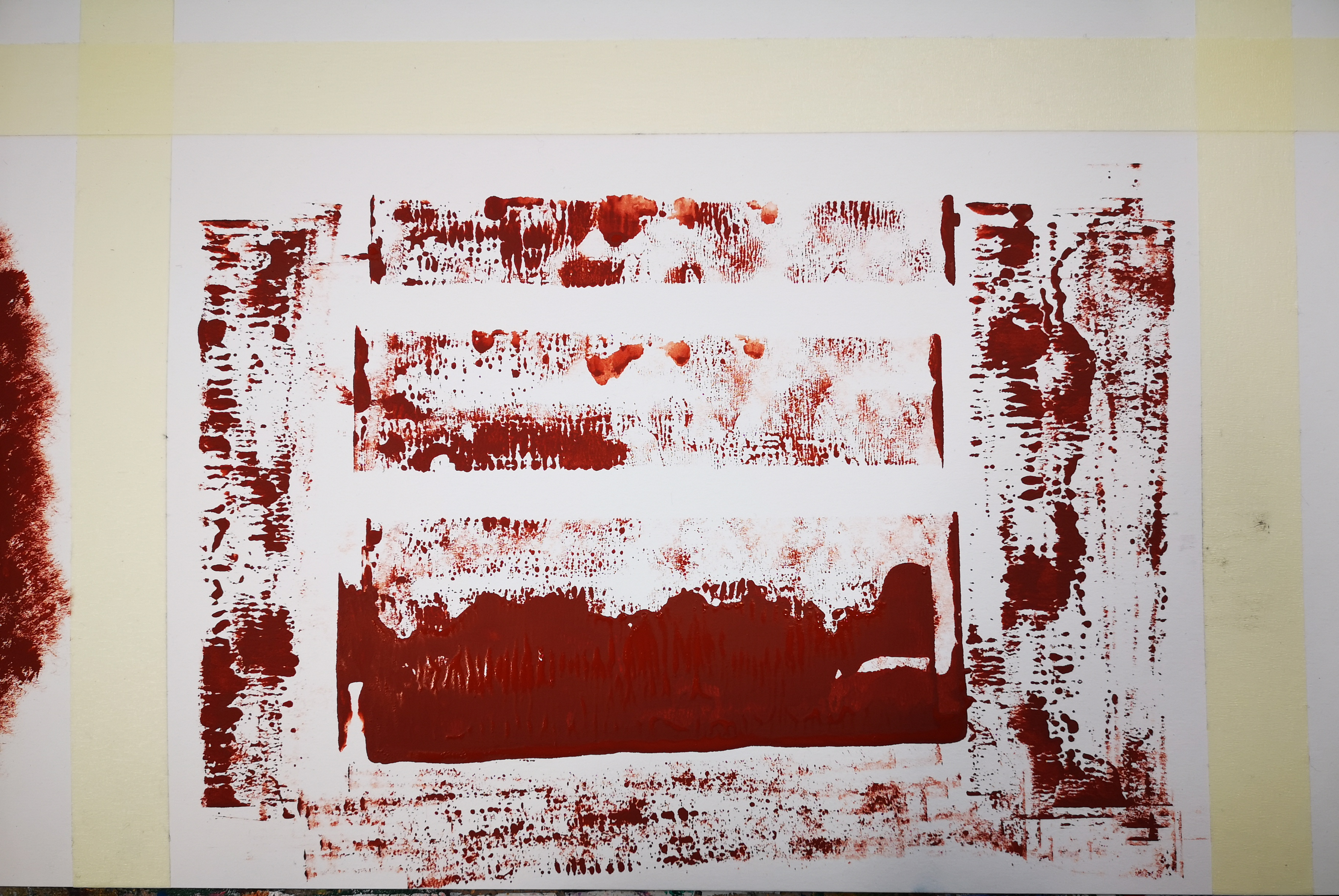
- In the fourth section, I created additive mono-print.
- Using acrylic sheet as a background, I used the same colour paint and by the help of prayer, I tried to cover acrylic sheet in such a way that the paint will look no more glossy and shiny.
- When the paint was 90% dry and no shinier on the acrylic sheet, I placed the image print on a sheet of new paper and fix the print out on the paper by the help of masking tape and placed the paper on the acrylic sheet in a way that I had the print out on the front side.
- By the help of a pencil, started outlining the lines and textures on the print out paper having the painted acrylic sheet underneath.
- After outlining most of the lines and textures I took off the paper and on the other back side of the page I found amazing printed textures and lines which I outlined.
dav 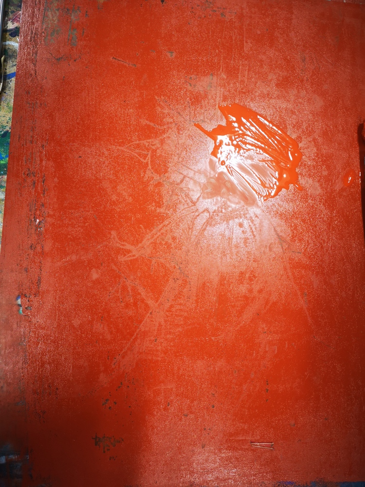
dav 
dav 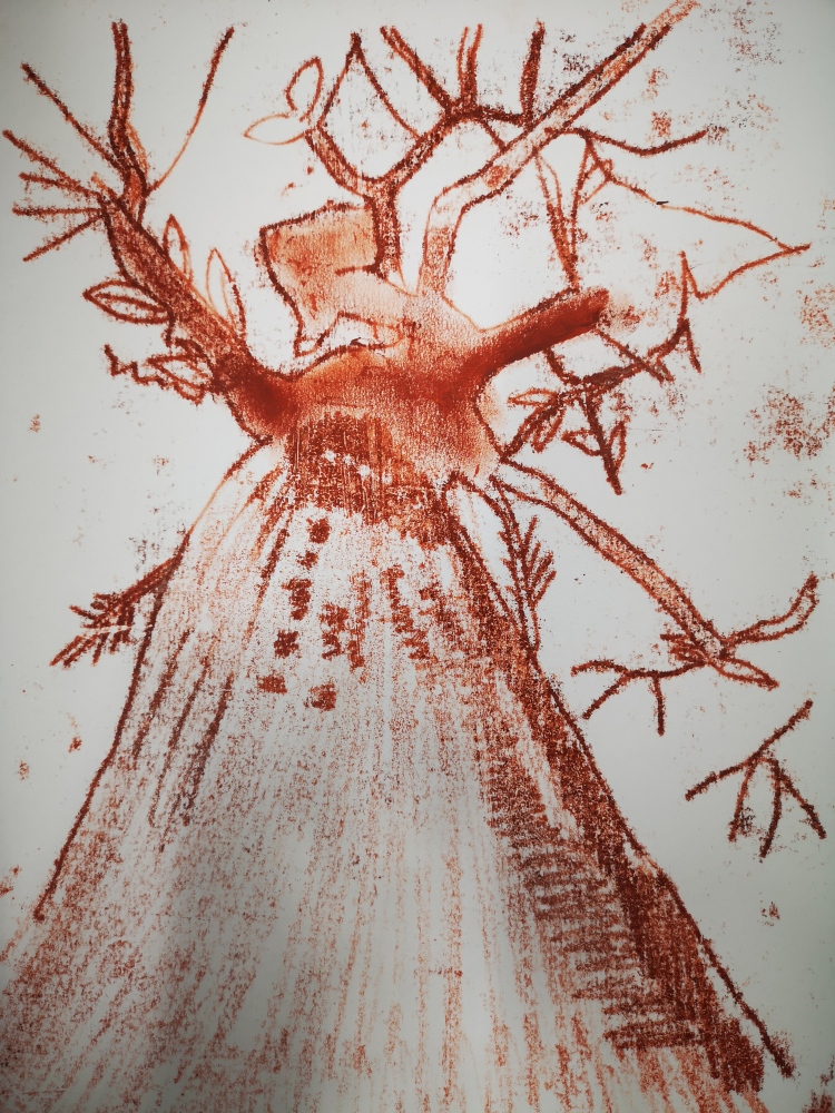
dav
LINO PRINT:
Lino printing is a form of printmaking in which the printing plate is cut into lino, as a linoleum. The lino is then inked and a piece of paper is placed on the top of the lino and then run through a pressing machine or a pressure applied by using hand to transfer the ink to the paper placed on it. The result of the paper is called linocut print.
CREATING LINO PRINT:
dav 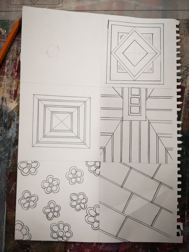
dav 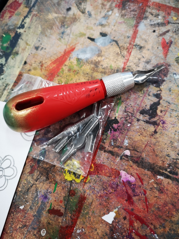
dav 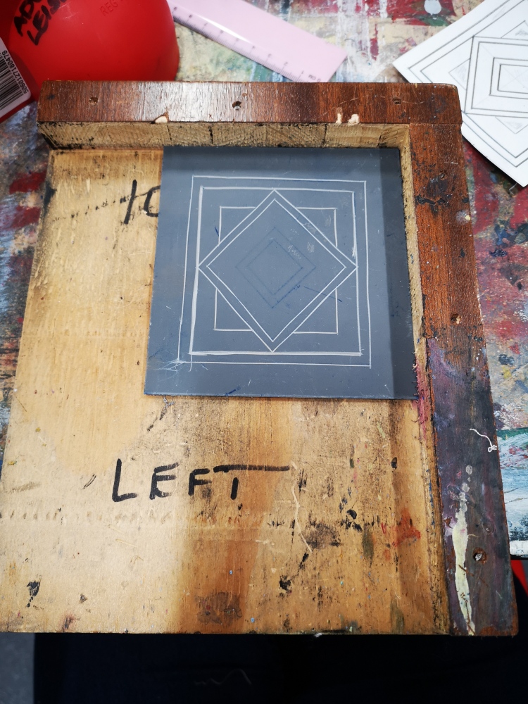
dav 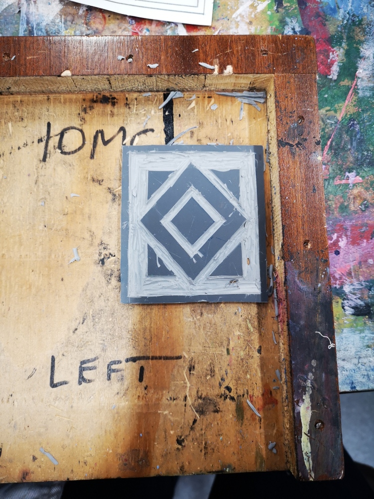
dav 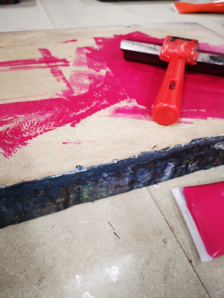
dav 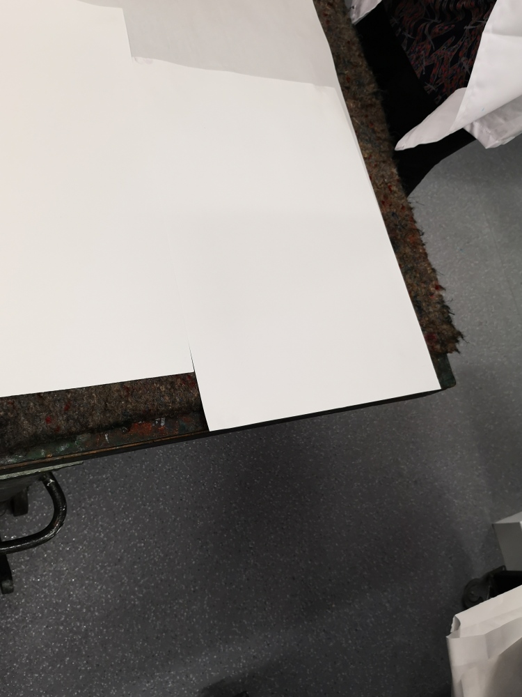
cof 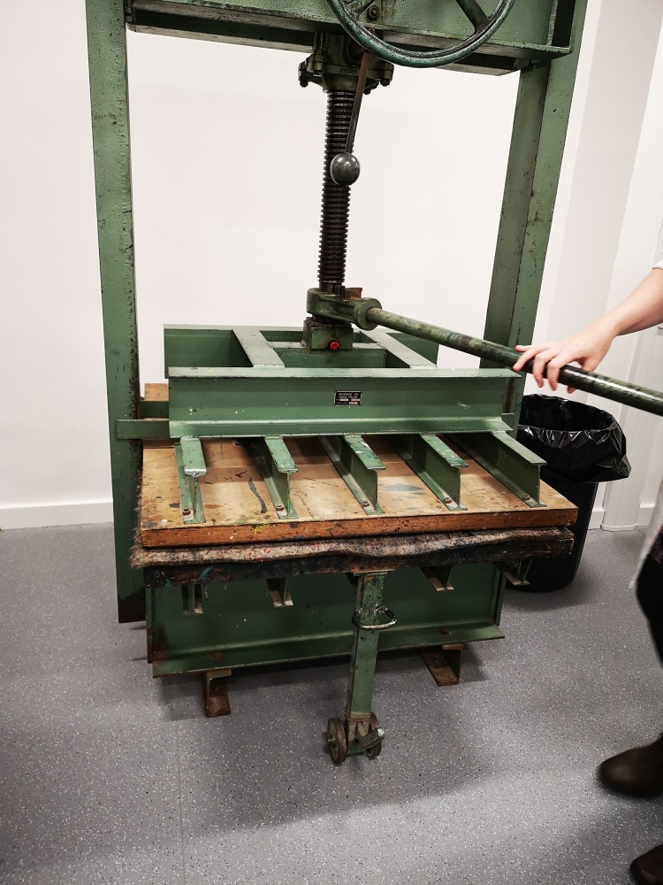
cof 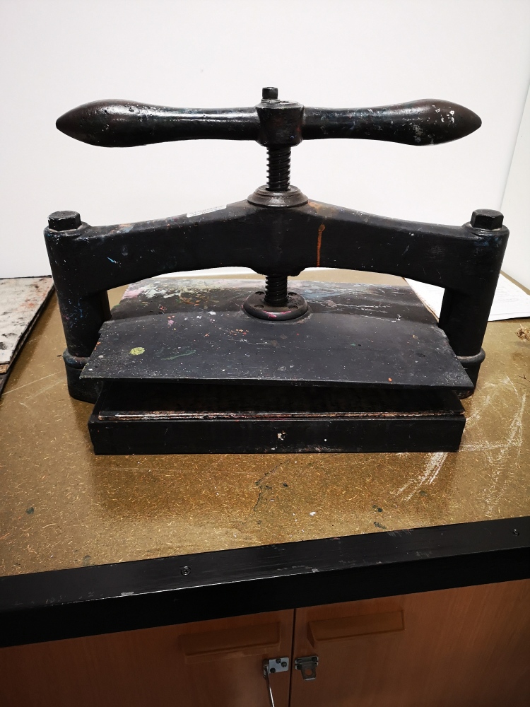
cof
- To transfer a design, I used a carbon sheet to trace the sketch by sliding a sheet of carbon paper underneath my drawing and then use a hard pencil to trace overdrawing. Once I have the outlines transferred, I remove the carbon paper and the drawing and use a pencil to highlight the areas that will print
- Using a Speedball handle and the accompanying blades, I carve out parts of the design that will not print and the areas which are not been carved with print later.
- I used a bench hook to help with safe carving, which provided an edge to hook onto the table and an edge against which to brace the linoleum.
- After that we prepared paper by using A4 paper, first wetting the paper and draining all the remained water.
- Rolled out paint on a wide space and used the brayer to roll out the ink into an evenly coated rectangle.
- Once the brayer was fully charged with ink I rolled it onto the linoleum. It took several passes to get the linoleum plate fully covered.
- Once the linoleum was fully coated, placed the paper on the top of the linoleum and used the drying rack to add pressure by sliding the tray full of linoleum design.
- After applying the pressure by moving the wheel several times, the lino print was ready.
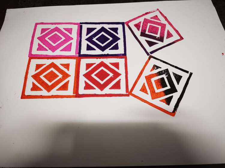
- As I wanted to repeat the design, I used the small dry rack and tried with different inks to create repetition
POTENTIALS OF LINO PRINT:
- Carving and embossing are enabled.
- Printing is possible.
- It is a cheap and easy process, a linocut provides with a unique print in terms of detailed textures and marks.
- Beneficial for simple designs, repetitive prints of the design is possible with different inks.
- The inks can still be very vibrant and can be overprinted, but mostly the ink sits on the surface of the medium. It can be three dimensional.
- It is easier to cut into linoleum than wood and therefore it is easier to create more flexible, fluid lines.
- It dries more quickly as compared to other printmaking forms which provides an advantage to produce a greater number of prints.
- Lino-cut print is safer as it is less toxic than other forms of printmaking.
DRY POINT PRINTING:
Drypoint printing is a technique used in preparing metal plates for printmaking by scratching the design on the metal plate. Thicker lines are made by applying more pressure to the (graver) or etching needle. The cold metal creates ragged ridges, called the burr. The burr is removed in copperplate engraving but not in drypoint where it is kept to produce soft, blurred line and painterly effects. Then the plate is coated with ink and whisked to ensure that the burr, as well as the line itself, absorbs ink. Prints are made by pressing the plate with great pressure on to the paper.
POTENTIALS OF DRY POINT PRINTING:
- In drypoint printing, there are no acids or other chemicals involved in creating the printing plate.
- Drypoint is one of the techniques that involve a certain level of drawing and generally produces quite linear images.
- By using the printing ink in a clever way, it is possible to build up intense flat coloured areas within a print.
ALBERT BESNARD, LA FEMME:

ANALYSIS:
The image above, La femme à la pèlerine (Woman in a cape), a woman viewed in profile in a black dress wearing a cape over her shoulders stands on a balcony, turning her head out towards the viewer and looking downward. While the figure is one from daily life, the artist left us to speculate on the mystery of her thoughts and feelings as presented in the print. The dark areas on the top in the form of the horizontal beam is helping to separate her world from ours and also her expressions are blank. I really like how the etching has been done which is helping the viewers to recognise different elements such as the place where she is standing looks like a balcony, her expressions are blank but easily seen because of less amount of etching used to show the face, her dress top and balcony shade. The detailing been considered during etching is spectacular.
Angie Hoffmeister :

The above drypoint print is made by Angie Hoffmeister, an artist and freelance illustrator from Düsseldorf in Germany. She creates art using a wide range of materials but she specialises in dry-point prints. I really like the dry-point above of a girl in a car because of the movement present in the still print more like as if she has captured a moving picture in 2d as the car can be seen as if it’s still moving and the girl’s head is bouncing. The girl’s face looks miserable and a sense of sadness can be seen in her eyes. The detail added to the hairs in another thing I liked because it is not too much detail but also not making the hairs part look empty. The double image effect added is one of the elements making this dry-point distinctive and also adding a continuous movement and motion to the print.
DRY-POINT PRINTMAKING PROCEDURE:
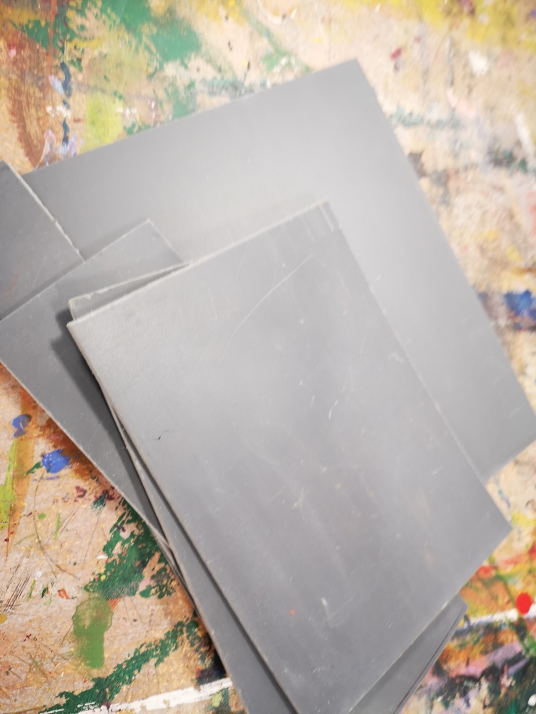
- To begin the process, I was been provided with a silver aluminium plate to start etching any sketch/drawing by using a pointed etching needle. I used a picture from London’s trip to start sketching by printing out the black and white version of the picture to make it easier to draw the image.
- By using carbon paper, I traced out the drawing on the silver plate by placing the sketch on top of the copper with the carbon paper face down in-between.
- The image was redrawn over the sketch and then I removed the papers to get the transferred image on the plate.
- After transferring a line drawing on the plate, I started scratching off the ground with the provided pointed etching needle to etch the plate according to the drawing.
- After the etching on the plate, out tutor guided us on how to apply the ink by placing the plate on the hot surface that helped in heating the metal plate and the printing ink became more viscous (gluey) when it was applied and helped the ink to flow smoothly in the etched marks.
- I inked the plate from all directions using a scrap of cardboard until the entire surface was covered with flat even tone.
- By using a piece of newspaper, I rubbed the plate until I got a matte look and the ink was mostly absorbed.
- Using pieces of newspaper, I first twist the ink into the lines using a circular motion, then using a cleaner piece I slowly removed ink from the plate until I got a thin, textured covering where I was able to see just enough of the image The key at that point was to leave enough ink on the plate for a good dark tone.
- By using pieces of cotton cloth, I removed the ink from some of the areas of the image. The trick here was to imagine a light source and work in the highlight areas according to your own choice. The plate was ready for printing.
- I soaked paper in the sink tub and squeezed the water from the paper, I transferred the inked plate on to the press, using a sheet of newsprint underneath the plate and placed the damp paper over the plate as close to the centre as possible and then carefully lower the 3 print blankets over. By moving the wheel of the press, the plate started to move under the rollers and the press bed came out from the other side.
- After removing the blankets, the ink was transferred successfully from the plate to the piece of paper.
PROCESS EVALUATION:
- I would say that the dry-point printing process was quite interesting to work on from the starting to the ending point.
- The process of etching the plate was time-consuming and challenging in terms of detailed drawing not with the pencil but with the etching needle on to the silver plate.
- The printing process was also challenging in terms of making sure how much ink needed to be removed in order to show any space or light in the final print.
- I enjoyed the process of printing, especially where we have to put the plate in the heater and apply the ink and the rubbing the ink, it was messy but I feel the final result was worth all the time and struggle.
- I am really proud of my prints because I was not expecting the first print to be perfect but I would say that the most important part was to etch the design deeply so each detail of the image will get print after applying the inks to the plate.
- I would definitely try to work with coloured inks next time if I will get a chance to work again with dry-point printing, I did try one print with coloured ink which I feel was a great experience to see the difference between coloured and black and white versions.
