The Role of Graphs in Monitoring and Optimizing Refining Activities and Product Quality in Oil and Gas
Graph analysis plays an important role in the dynamic world of oil and gas processing, where efficiency and precision are critical. As visual representations of data, graphs offer a potent way to track, examine, and improve several facets of refining operations. No matter how complex oil and gas refinery operations may be, with hundreds or even thousands of temperature, pressure, flow, and level transmitters that control room operators constantly monitor, graphs can simplify all operations for decision-making both during and after refining activities. Graphs provide information that is essential for making well-informed decisions, whether they are used to monitor temperature profiles, evaluate flow rates, or verify that strict quality standards are being followed.
Graphical analysis in the context of refining involves the use of diverse visual tools, each serving a specific purpose. From chronograms to real-time monitoring dashboards, these graphical representations enable refinery operators to navigate the complexities of their operations with precision. In this article, we will focus on real-time monitoring dashboards, and examples will be used to buttress our point.
For executives overseeing oil and gas facilities, such as Chief Executive Officers (CEOs), Managing Directors (MDs), Directors, General Managers (GMs), Operations Managers, Supervisors, Team Leads, Process Operators, and other crucial personnel, a comprehensive graphical depiction of diverse facility components is a fundamental resource. This graphical representation serves as a pivotal tool, enabling real-time monitoring and fostering a nuanced comprehension of operational status. Its utility extends to empowering informed decision-making at the highest echelons of organizational leadership. In the subsequent sections of this article, we will delve into the methodologies of interpreting graphs derived from various Key Performance Indicators (KPIs), process variables, and other pertinent factors, shedding light on the process of making well-informed decisions based on these graphical insights.
REAL-TIME MONITORING DASHBOARD
Real-time monitoring dashboards have become a vital tool for refinery operators in the fast-paced, dynamic world of oil and gas processing. A thorough and interactive visual depiction of process variables, key performance indicators (KPIs), and other important data points is offered by these dashboards. In contrast to static data, real-time monitoring dashboards provide operators with real-time insights into refining processes, enabling them to make informed decisions quickly.
Some common features of the real-time monitoring method include:
Dynamic Data Visualization:
Dashboards for real-time monitoring dynamically visualize data and offer it in an easily understood visual style. Refinement activities are currently reflected in real-time through the updating of graphs, charts, and other graphical elements.
Key Performance Indicators (KPIs):
Dashboards prominently display KPIs relevant to refining, such as production rates, energy consumption, and product quality metrics. Operators can easily track these KPIs and identify deviations from target values, enabling proactive decision-making.
Process Variables:
Interactive dashboards provide a detailed view of various process variables, including temperatures, pressures, and flow rates. Operators can monitor these variables in real-time, allowing for quick identification and resolution of any anomalies or fluctuations.
Applications in tracking and optimizing refining activities
Real-time monitoring dashboards find diverse applications in refining, contributing to operational excellence, efficiency improvements, and proactive troubleshooting.
Detection of Issues:
Dashboards enable the early detection of operational issues or deviations from optimal conditions. Operators can identify and address potential problems before they escalate, minimizing downtime and production disruptions.
Optimization Opportunities:
By continuously monitoring process variables, operators can identify optimization opportunities for energy consumption, resource utilization, and overall process efficiency. Historical data and trend analysis tools integrated into dashboards aid in recognizing patterns and areas for improvement.
Decision Support:
Real-time dashboards serve as decision support systems, providing operators with the information needed to make timely and informed decisions. Operators can respond swiftly to changing conditions, whether it involves adjusting process parameters, rerouting materials, or implementing contingency plans.
Integration with Control Systems:
Dashboards often integrate with control systems, allowing operators to directly interact with and control various elements of the refining process. This integration enhances the responsiveness of operators and facilitates seamless coordination between monitoring and control activities.
Remote Monitoring and Collaboration:
With the advent of cloud-based technologies, real-time dashboards enable remote monitoring and collaboration. Refinery personnel, including engineers and managers, can access the dashboards from different locations, fostering collaboration and ensuring a swift response to operational challenges.
In order to have a more in-depth understanding of this, we will take a look at four graphical representations: crude production tank, diesel storage tank, fuel oil storage tank, and furnace outlet temperature profile.
GRAPH VISUALIZATION AND INTERPRETATION
Proficiency in graph visualization and interpretation within oil and gas dashboards is an essential skillset requisite for managers and operators of oil and gas facilities. This proficiency is indispensable for tasks such as forecasting, comprehensive analysis, decision-making, and addressing operational bottlenecks.
Diverse graphs derived from distinct components of the facility, including Key Performance Indicators (KPIs) such as production flowrates and energy consumption, as well as process variables like temperature, pressure, and level, are employed by various personnel within the organization. These personnel utilize the graphs for forecasting, in-depth analysis, and pivotal decision-making concerning the efficient operation and management of the oil and gas facility.
Executives such as CEOs, MDs, and directors, primarily focusing on financial aspects, will find graphs generated from KPIs pertinent to their responsibilities. On the other hand, general managers, supervisors, team leads, and process operators engage with graphs derived from all components of the dashboard.
As earlier indicated, this article will concentrate on four graphical representations: crude production tank, diesel storage tank, fuel oil storage tank, and, finally, the furnace outlet temperature profile, to underscore our key points.
GRAPH OF CRUDE (FEED) PRODUCTION TANK LEVEL
In crude refineries, the crude production tank serves as a storage vessel for crude feedstock before it undergoes processing in the designated area. In the context of this article, the graphical representation of crude production will be derived from the level transmitter installed on the production tank. Conversely, in gas refining facilities where feedstock storage may not be required, the graph can be sourced from the Flow Indicator Controller (FIC) located at the battery limit. The FIC serves an analogous purpose in monitoring the volume of natural gas entering the processing area.

To comprehend the graph presented in figure 1 above, it is subdivided into three (3) distinct sections (A-C).
Section A denotes a stationary point, signifying the initial tank level in millimeters before the commencement of production activities. This implies that the initial crude level in the tank was approximately 6000 millimeters, and consulting the chart calibration for this tank would yield the precise quantity of crude in the tank prior to production.
Section B, characterized by a descending slope, indicates a reduction in the tank level attributed to ongoing production activities. This segment holds significant importance as both management and process operators can determine the quantity of crude that can be processed within a specified timeframe. Such insights are crucial for forecasting and decision-making, with the potential for deriving various financial assumptions from this section.
Section C reveals an elevation in tank level, attributed to inter-tank transfers from the main crude storage tank to the crude production tank. This section illuminates the dynamic nature of the refining process, highlighting the strategic movement of resources within the facility.
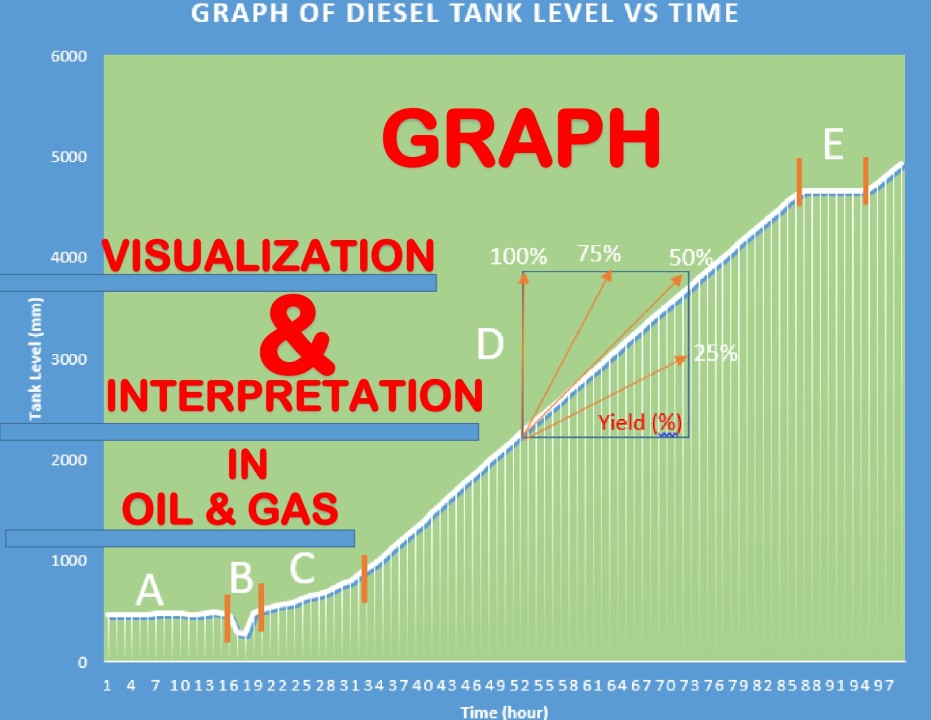
GRAPH OF DIESEL STORAGE TANK LEVEL

To facilitate a comprehensive understanding of the graph depicted in Figure 2, it is segmented into four distinct sections (A-D), each elucidating the dynamic progression of a diesel storage tank from the start-up procedure to full production.
Section A: This section signifies the initial level of the diesel tank, characterized by a gradual increase during the start-up procedure. It marks the commencement of the production cycle.
Section B: A sudden drop in the tank level causes a discernible downward peak, attributed to a transmitter glitch. Transmitters, susceptible to glitches induced by various factors, including measurement elements, can introduce temporary discrepancies in the recorded data.
Section C: This part illustrates the continued gradual increase of diesel within the tank, reflecting the ongoing production process.
Section D: A consistent production slope of diesel in the tank is depicted in this section, accompanied by a blue box indicating the percentage yield of diesel production. The trend line on the graph indicates that a percentage yield of 47.5% was obtained during this production. The 47.5% yield, as highlighted in the box, holds significance, and its interpretation varies based on the refinery's design and intended product outputs. In the context of a plant designed to produce diesel, fuel oil, and naphtha, along with by-products like produced water and gas, a 47.5% yield suggests that for every 100,000 barrels of crude refined, approximately 47,500 barrels of diesel are obtained. The remaining 52,500 barrels comprise fuel oil, naphtha, and a small proportion of produced water and gas.
Section E: This part reveals a stationary point in the tank where there is no level increase in diesel. Such scenarios could result from various factors, including temporary shutdowns in refining operations or a switch from this specific diesel tank to the diesel spare storage tank – a common occurrence in facilities with multiple storage options for each product.
This detailed breakdown aims to elucidate the nuances within each section of the graph, providing a comprehensive understanding of the diesel storage tank's behavior throughout its operational phases.
GRAPH OF FUEL OIL TANK LEVEL

To facilitate a thorough comprehension of Figure 3, portraying the graph of the fuel oil storage tank, the illustration is segmented into four distinct sections (A-D), each delineating specific phases in the tank's operational dynamics.
Section A: This section signifies a gradual increase in the tank level, indicative of an ongoing filling process or influx of fuel oil.
Section B: A steady production increase is depicted in this segment, highlighting a sustained upward trend in fuel oil levels. Similar to diesel, the percentage yield of fuel oil can be determined using established methods.
Section C: A discernible downward slope characterizes this part, indicating a reduction in the tank level. This decline is attributed to loading operations where fuel oil is transferred, either to external trucks or through pipelines to alternative destinations.
Section D: This portion illustrates a subsequent increase in the tank level, suggesting the conclusion of loading operations and a return to the tank's regular production and storage cycle.
GRAPH OF FURNACE OUTLET TEMPERATURE PROFILE

In the realm of refineries, the furnace or fire heater stands as one of the most critical pieces of equipment, while the cold box, consisting of refrigeration equipment, is integral to gas plant operations. The ability to adeptly visualize and interpret graphs pertaining to these crucial pieces of equipment is of paramount importance, particularly for process operators, team leads, supervisors, and other key personnel. Figure 4 above presents the graph of the furnace outlet temperature during crude refining operations. To facilitate a comprehensive understanding, the graph is meticulously divided into five (5) sections.
Section A: This section portrays a gradual increase in furnace outlet temperature, typically observed when the pilot burner is activated, and the operation is in a closed-loop state. This initial phase sets the foundation for subsequent temperature variations.
Section B: A further gradual increase, ranging from approximately 100 to 150 degrees Celsius, is illustrated in this segment. During this phase, the closed-loop operation persists, and dehydration processes take place.
Section C: This stage depicts a temperature elevation to approximately 200 to 250 degrees Celsius. The operation remains in a closed loop, and mechanical hot tightening procedures are executed, contributing to the evolving dynamics of the furnace outlet temperature.
Section D: This segment reveals a sequential rise in furnace temperature, progressing from 250 degrees to the desired optimum production temperature. During this phase, the closed-loop operation concludes, and the system shifts into full production mode.
Section E: The graph culminates in this section, indicating an optimum and stationary furnace temperature. This phase represents the stabilized operating conditions and serves as a crucial reference point for monitoring furnace performance.
The graph of furnace outlet temperature holds significant potential for making informed assumptions, conducting forecasting, in-depth analysis, and pivotal decision-making. While the breadth of its implications exceeds the scope of this article, it underscores the substantial value that skilled interpretation of such graphs brings to the efficient and effective operation of refining processes.
CONCLUSION
Conclusively, this article has underscored the indispensable role of graph visualization and interpretation in the realm of oil and gas refining operations. From monitoring the crude production tank to analyzing diesel and fuel oil storage, and scrutinizing the intricate dynamics of a furnace outlet temperature, graphs serve as invaluable tools for process operators, managers, and decision-makers. The ability to decipher these graphical representations empowers professionals in the industry to optimize efficiency, ensure product quality, and make informed decisions crucial to the operational success of refineries.
As we delved into the specifics of crude refining, diesel and fuel oil storage, and furnace operations, it became evident that the interpretation of these graphs extends beyond mere data analysis. The graphs encapsulate the heartbeat of the refinery, conveying critical information about production levels, efficiency, and adherence to regulatory standards.
In the ever-evolving landscape of the oil and gas industry, where precision and efficiency are paramount, a nuanced understanding of graphical data becomes a cornerstone for success. The ability to interpret these graphs equips professionals with the insights needed to navigate operational challenges, optimize resource utilization, and ensure the smooth and effective functioning of refining facilities.
While this article has focused on specific graphical representations, it is imperative to acknowledge that technological advancements continue to shape the landscape of refining operations. Future developments in data analytics, artificial intelligence, and enhanced visualization tools are poised to further revolutionize the way professionals in the industry interpret and utilize graphical data.
In essence, the journey through the various sections of this research has illuminated the transformative power of graphs in monitoring and optimizing oil and gas refining activities. As we move forward, the integration of cutting-edge technologies and a continual commitment to refining the interpretation of graphical data will be instrumental in steering the industry towards even greater heights of efficiency, sustainability, and operational excellence.
Organizational Alchemist & Catalyst for Organizational Excellence: Turning Team Dynamics into Pure Gold | Founder at UEC Business Consulting
2moUnderstanding the visual data is key to informed decision-making at the executive level.