stat_compare_means comparisons with multiple groups #65
Comments
|
Hi, Groups to be compared should be on x-axis not in the legends. I would go as follow: Plot y= expression by x = status and then facet by SYMBOL. ggplot(mydata, aes(x = status, y = expression)) +
facet_wrap(~SYMBOL)+
stat_compare_means(comparisons = list(c("HER2+", "triple-negative")))This will create a multi-panel plot. Each panel correspond to a gene |
|
Thanks, that's a good workaround! |
|
One issue remains: p-value adjustment does not apply for facetted plots. I think it should. |
|
To display adjusted p-values, use : stat_compare_means(aes(label=..p.adj..)) |
|
Yes, but it does not adjust for multiple facets. Take the example below, it displays exactly the same p-value both for adjusted and non-adjusted: library(ggplot2)
library(ggpubr)
library(tidyverse)
a = rnorm(mean=1, 100)
b = rnorm(mean=1.5, 100)
data = rbind_all(list(
data.frame(facet=1, group="A", value=a),
data.frame(facet=2, group="A", value=a),
data.frame(facet=1, group="B", value=b),
data.frame(facet=2, group="B", value=b)
))
data %>%
ggplot(aes(y=value, x=group)) +
geom_boxplot() +
facet_wrap(~facet) +
stat_compare_means(aes(label=..p..))
data %>%
ggplot(aes(y=value, x=group)) +
geom_boxplot() +
facet_wrap(~facet) +
stat_compare_means(aes(label=..p.adj..)) |
|
ok, I can see now: The R code below returns the adjusted p-value: But, the function This issue is related to the way ggplot2 facet works. When using facet, statiscal computation is applied to each single panel independently. As for each panel we have only one single comparison, the adjusted p-value remains unchanged. I will work on this. A solution would be to give an option to users to annotate the plot using the output of compare_means() |
|
Hi, I have exactly the same the problem. Just leaving a note here if an update is available. |
|
A hack to annotate with adjusted pvals
|

|
Another hacky solution by modifying the ggplot object itself. This keeps the placement and formatting of the labels created by ggpubr. Should also help #86 with some adjustments. |
|
I tried these hacks but couldn't get it to work. Is there any development on this issue? In my case, what I'm trying to achieve is slightly different, however. I have 4 groups plotted on the same graph (the same variable measured) and I'd like to add |
|
Please provide a reproducible R code. Specify the argument The following solution works for me: library(ggpubr)
library(ggsignif)
library(tidyverse)
df <- ToothGrowth
# annotation table with adjusted pvals and y-position of the labels
anno_df <- compare_means(len ~ supp, group.by = "dose", data = df, p.adjust.method = "holm") %>%
mutate(y_pos = 40, p.adj = format.pval(p.adj, digits = 2))
# Create a boxplot and add custom p-value
ggboxplot(df, x = "supp", y = "len", ggtheme = theme_bw())+
facet_wrap(~dose) +
geom_signif(
data=anno_df,
aes(xmin = group1, xmax = group2, annotations = p.adj, y_position = y_pos),
manual= TRUE
)
|

|
Hi, please see my reprex below. I tried @dregele's solution and it worked for me. It is a nice workaround but involves few extra lines. The issue of that approach is scalability, I think. I want to create a loop function in which numerous graphs are generated by going through different genes. The main problem I'm running into in this implementation is the need of passing gene names (variable names in the I also tried to edit the function itself to replace library(ggpubr)
#> Loading required package: ggplot2
#> Loading required package: magrittr
# Simulate data frame of 20 observations for a gene across 4 groups of sample (5 each)
df <- data.frame(matrix(NA, nrow=20, ncol = 2))
colnames(df) <- c("Sample", "Gene_expr")
df$Sample <- rep(c("Control", "Drug_1", "Drug_2", "Drug_3"), each = 5)
df$Gene_expr <- c(rnorm(5, mean = 1, sd = 1),
rnorm(5, mean = 2, sd = 1.5),
rnorm(5, mean = 4, sd = 0.5),
rnorm(5, mean = 8, sd = 2))
# Comparisons I care about
my_comparisons <- list(c("Control", "Drug_1"),c("Control", "Drug_2"),c("Control", "Drug_3"))
# See all pair-wise comparisons
compare_means(Gene_expr~Sample, df, method = "t.test")
#> # A tibble: 6 x 8
#> .y. group1 group2 p p.adj p.format p.signif method
#> <chr> <chr> <chr> <dbl> <dbl> <chr> <chr> <chr>
#> 1 Gene_expr Control Drug_1 0.0143 0.0178 0.01431 * T-test
#> 2 Gene_expr Control Drug_2 0.000441 0.00265 0.00044 *** T-test
#> 3 Gene_expr Control Drug_3 0.00121 0.00483 0.00121 ** T-test
#> 4 Gene_expr Drug_1 Drug_2 0.000950 0.00475 0.00095 *** T-test
#> 5 Gene_expr Drug_1 Drug_3 0.00297 0.00890 0.00297 ** T-test
#> 6 Gene_expr Drug_2 Drug_3 0.00891 0.0178 0.00891 ** T-test
# This plots unadjusted p value (p.format column)
ggboxplot(df, x="Sample", y="Gene_expr", fill = "Sample")+
stat_compare_means(comparisons=my_comparisons, method = "t.test", aes(label=..p.adj..))Created on 2018-06-28 by the reprex package (v0.2.0). |

|
Tried with that order but didn't work for me (please see below). Also, a point of curiosity: Are the library(ggpubr)
#> Loading required package: ggplot2
#> Loading required package: magrittr
set.seed(123)
# Simulate data frame of 20 observations for a gene across 4 groups of sample (5 each)
df <- data.frame(matrix(NA, nrow=20, ncol = 2))
colnames(df) <- c("Sample", "Gene_expr")
df$Sample <- rep(c("Control", "Drug_1", "Drug_2", "Drug_3"), each = 5)
df$Gene_expr <- c(rnorm(5, mean = 1, sd = 1),
rnorm(5, mean = 2, sd = 1.5),
rnorm(5, mean = 4, sd = 0.5),
rnorm(5, mean = 8, sd = 2))
# Comparisons I care about
my_comparisons <- list(c("Control", "Drug_1"),c("Control", "Drug_2"),c("Control", "Drug_3"))
# See all pair-wise comparisons
compare_means(Gene_expr~Sample, df, method = "t.test")
#> # A tibble: 6 x 8
#> .y. group1 group2 p p.adj p.format p.signif method
#> <chr> <chr> <chr> <dbl> <dbl> <chr> <chr> <chr>
#> 1 Gene_expr Control Drug_1 0.425 0.425 0.42489 ns T-test
#> 2 Gene_expr Control Drug_2 0.000521 0.00313 0.00052 *** T-test
#> 3 Gene_expr Control Drug_3 0.00379 0.0190 0.00379 ** T-test
#> 4 Gene_expr Drug_1 Drug_2 0.0454 0.0952 0.04543 * T-test
#> 5 Gene_expr Drug_1 Drug_3 0.00431 0.0190 0.00431 ** T-test
#> 6 Gene_expr Drug_2 Drug_3 0.0317 0.0952 0.03173 * T-test
# This plots unadjusted p value (p.format column)
ggboxplot(df, x="Sample", y="Gene_expr", fill = "Sample")+
stat_compare_means(mapping=aes(label=..p.adj..), comparisons=my_comparisons, method = "t.test")Created on 2018-06-28 by the reprex package (v0.2.0). |

|
In your example, you are comparing each group against a reference, here "Control". Load required packages and create a demo data setlibrary(ggpubr)
library(tidyverse)
# Create a demo gene expression data
#+++++++++++++++++++++++++++++++++++++
Sample <- rep(c("Control", "Drug_1", "Drug_2", "Drug_3"), each = 5)
gene1 <- c(
rnorm(5, mean = 1, sd = 1),rnorm(5, mean = 2, sd = 1.5),
rnorm(5, mean = 4, sd = 0.5), rnorm(5, mean = 8, sd = 2)
)
gene2 <- 2*gene1
gene3 <- 1.5*gene1
df <- data_frame(Sample = Sample, gene1 = gene1, gene2 = gene2, gene3 = gene3)
# Inspect 6 random rows
#+++++++++++++++++++++++++++++++++++++
set.seed(123)
sample_n(df, 6)# A tibble: 6 x 4
Sample gene1 gene2 gene3
1 Drug_1 1.824137 3.648274 2.736206
2 Drug_2 3.475553 6.951107 5.213330
3 Drug_1 3.920832 7.841665 5.881248
4 Drug_3 10.589527 21.179053 15.884290
5 Drug_3 9.651080 19.302159 14.476620
6 Control 1.800554 3.601109 2.700831
Easy solution to visualize the gene expression with p-value (comparing to the reference group)Adjusted p-values are shown: ggboxplot(df, x="Sample", y="gene1", fill = "Sample")+
stat_compare_means(
mapping=aes(label = format.pval(..p.adj.., digits = 1)),
method = "t.test", ref.group = "Control"
)
Solution two# Helper functions to visualize one gene expression with pvalue
#+++++++++++++++++++++++++++++++++++++
plot_expr <- function(.gene, .data, .grp = "Sample", .ref.group = "Control"){
# Compute p-values
comparison.formula <- paste0(.gene, "~", .grp) %>%
as.formula()
pvalues <- compare_means(
comparison.formula, data = .data,
method = "t.test", ref.group = .ref.group
)
# P-value y coordinates
y.max <- .data %>%
pull(.gene) %>% max(na.rm = TRUE)
p.value.y.coord <- rep(y.max, nrow(pvalues))
step.increase <- (1:nrow(pvalues))*(y.max/10)
p.value.y.coord <- p.value.y.coord + step.increase
pvalues <- pvalues %>%
mutate(
y.coord = p.value.y.coord,
p.adj = format.pval(p.adj, digits = 1)
)
ggboxplot(.data, x = .grp, y = .gene, fill = .grp)+
ggsignif::geom_signif(
data = pvalues,
aes(xmin = group1, xmax = group2, annotations = p.adj, y_position = y.coord),
manual= TRUE, tip_length = 0.03, size = 0.4
)
}
# Visualize gene 1
plot_expr("gene1", .data = df, .grp = "Sample", .ref.group = "Control")
|

|
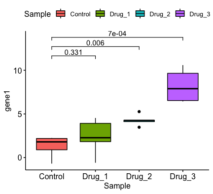
Thanks for the insights. In my reprex, I just focused on the comparisons with control group as an example. I'm also interested in comparing the drug treatments with each other as well for my actual data analysis. How can I go about doing this in that case? I can think of passing one of the groups (i.e. My end goal is generating something like this (with Created on 2018-06-29 by the reprex package (v0.2.0). |

|
(To answer my previous question) With some help from Stack Overflow, I edited the plotting function that @kassambara wrote to include a library(ggpubr)
#> Loading required package: ggplot2
#> Loading required package: magrittr
library(tidyverse)
# Create a demo gene expression dataset.seed(1)
Sample <- rep(c("Control", "Drug_1", "Drug_2", "Drug_3"), each = 5)
gene1 <- c(
rnorm(5, mean = 1, sd = 1),rnorm(5, mean = 2, sd = 1.5),
rnorm(5, mean = 4, sd = 0.5), rnorm(5, mean = 8, sd = 2)
)
gene2 <- 2*gene1
gene3 <- 1.5*gene1
df <- data_frame(Sample = Sample, gene1 = gene1, gene2 = gene2, gene3 = gene3)
# Inspect 6 random rows
set.seed(123)
sample_n(df, 6)
#> # A tibble: 6 x 4
#> Sample gene1 gene2 gene3
#> <chr> <dbl> <dbl> <dbl>
#> 1 Drug_1 0.769 1.54 1.15
#> 2 Drug_2 4.56 9.12 6.84
#> 3 Drug_1 3.11 6.21 4.66
#> 4 Drug_3 7.91 15.8 11.9
#> 5 Drug_3 7.97 15.9 12.0
#> 6 Control 0.374 0.747 0.560
plot_adjP <- function(.gene, .data, .grp = "Sample", comparisons = NULL){
# Compute p-values
comparison.formula <- paste0(.gene, "~", .grp) %>%
as.formula()
pvalues <- compare_means(
comparison.formula, data = .data,
method = "t.test"
)
# If a comparison list is provided, extract the comparisons of interest for plotting
if(!is.null(comparisons)){
comparisons <- list(c("Control", "Drug_1"), c("Drug_2" ,"Drug_3"))
pvalues <- map_df(comparisons, ~ pvalues %>% filter(group1 == .x[1] & group2 == .x[2]))
}
# P-value y coordinates
y.max <- .data %>%
pull(.gene) %>% max(na.rm = TRUE)
p.value.y.coord <- rep(y.max, nrow(pvalues))
step.increase <- (1:nrow(pvalues))*(y.max/10)
p.value.y.coord <- p.value.y.coord + step.increase
pvalues <- pvalues %>%
mutate(
y.coord = p.value.y.coord,
p.adj = format.pval(p.adj, digits = 1)
)
ggboxplot(.data, x = .grp, y = .gene, fill = .grp)+
ggsignif::geom_signif(
data = pvalues,
aes(xmin = group1, xmax = group2, annotations = p.adj, y_position = y.coord),
manual= TRUE, tip_length = 0.03, size = 0.4
)
}
comparisons <- list(c("Control", "Drug_1"), c("Drug_2", "Drug_3"))
# Visualize gene 1
plot_adjP("gene1", .data = df, .grp = "Sample", comparisons = comparisons)
#> Warning: Ignoring unknown aesthetics: xmin, xmax, annotations, y_positionplot_adjP("gene1", .data = df, .grp = "Sample")
#> Warning: Ignoring unknown aesthetics: xmin, xmax, annotations, y_position |


|
Oh great, thank you for your contribution. I'll add new features in ggpubr, to simplify this process. I think also that, when users provide a specific number of comparisons to be performed, the pvalues should be adjusted/re-adjusted according to that number of tests, but not according to the number of all possible comparisons. So in the above helper function, after filtering (using map_df), one might need to re-adjust the p-values. I'll take this into account in the new features |
|
Perfect! Thanks! Ggpubr rocks |
|
Hi,
But when I want to do this for multiple columns I get this:
It is only plotting p-values from 2 comparisons for the first column and 1 for the second....What am I doing wrong here? When I run compare_means it seems to calculate all the possible combinations just fine. Here my code to reproduce the problem with some test data:
|


|
@FFoQS90: the problem is that you're trying to add p-values by comparing one numeric value vs one numeric value. You should compare groups of values. The following R code works for me. library(ggpubr)
ggboxplot(
ToothGrowth, x = "dose", y = "len",
facet.by = "supp", ylim = c(0, 45)
) +
stat_compare_means(
comparisons = list(c("0.5", "1"), c("1", "2"), c("0.5", "2")),
label = "p.signif"
)
ggbarplot(
  ToothGrowth, x = "dose", y = "len",
  add = "mean_se",
  facet.by = "supp", ylim = c(0, 45)
  ) +
  stat_compare_means(
    comparisons = list(c("0.5", "1"), c("1", "2"),  c("0.5", "2")),
    label = "p.signif"
    )
|


|
Thank you for helping me out here. I could get it to work by using ggbarplot or ggboxplot(...facet.by=..) instead of ggplot(data, aes..)+geom_bar()+facet_grid()!! Is it possible that geom_bar() or facet_grid() are somehow causing the problem? |
|
Thanks, the new function stat_pvalue_manual works great!! |
|
Now, the new function library(tidyverse)
library(rstatix)
library(ggpubr)
# Pairwise t-test between groups
stat.test <- ToothGrowth %>%
group_by(dose) %>%
t_test(len ~ supp) %>%
adjust_pvalue() %>%
mutate(y.position = 35)
stat.test# A tibble: 3 x 9
dose .y. group1 group2 statistic p method p.adj y.position
1 0.5 len OJ VC 3.1697328 0.0064 T-test 0.0128 35
2 1.0 len OJ VC 4.0327696 0.0010 T-test 0.0030 35
3 2.0 len OJ VC -0.0461361 0.9600 T-test 0.9600 35
# Create a box plot and add the p-value
p <- ggboxplot(
  ToothGrowth, x = "supp", y = "len",
  color = "supp", palette = "jco",
  facet.by = "dose", ylim = c(0, 40)
)

p + stat_pvalue_manual(stat.test, label = "p.adj")
|

|
Hi, Is it possible to not have to specify the y.position i.e. coordinates for the absolute positioning of the p-value label? Looking forward to a work around this issue. |
|
Is it possible to do stat_compare_means on a stacked barplot between 2-factor levels of genes (x-axis) vs 2-factor levels on y-axis? |
|
Part of the issue may be the version of ggpubr. I posted a similar question earlier this week: While I had just downloaded the package and thought I was running the most current package, sessionInfo() said I was running 0.1.5. After I updated to ggpubr_0.2, I was able to get stat_compare_means to recognize data=subset(data,by=Treatment) for my comparisons. One thing to note, use facet.by="Treatment" in the ggbarplot line to check that the pvalues shown when you do the combined plot are for the subsetted data. When it wasn't working in the older version, I would get a p-value for the pooled group (treated and untreated), ignoring the selected data. This may help part of your problem (and provide a work around if you put every comparison you want in the my_comparisons) but I have not found a way to do those comparisons automatically. My question now is if there is a way to move the brackets above the first plot to center over the data being compared, not centered over the group for both treatment levels? |


Hello, But I used above data and code can't get similar picture. And I got some warning messages: |


|
Hello everyone, |
|
Hi Any idea to solve the issue? Create some example dataFirst example:A tibble: 3 x 8Second Example:A tibble: 3 x 8 |
|
Hi, |
Was this ever resolved? |
|
To add p-values onto grouped plots, please consider the following blog post: How to Add P-Values onto a Grouped GGPLOT using the GGPUBR R Package First, make sure you have installed the lates dev version of rstatix and ggpubr before following the tutorial: devtools::install_github("kassambara/rstatix")
devtools::install_github("kassambara/ggpubr") |
|
Could this be elaborated to multiple facets? For example: |
|
Potential solution to when you have multiple facets: stat.test <- df %>% test + stat_pvalue_manual( |
|
I am having an Error while using Using the function on the above data.
This is the ERROR: |
|
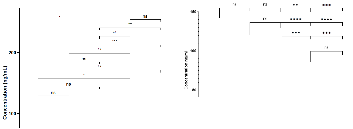
Is there an argument that allow significance horizontal lines to be adjacent not above each other. Because as the number of categorical variables on x-axis increase the number of co |
|
@HijaziHassan using the argument suppressPackageStartupMessages(library(ggpubr))
# Pairwise comparisons: Specify the comparisons you want
my_comparisons <- list( c("0.5", "1"), c("1", "2"), c("0.5", "2") )
p <- ggboxplot(ToothGrowth, x = "dose", y = "len",
color = "dose", palette = "npg")
# Add pairwise comparisons p-value
p + stat_compare_means(comparisons = my_comparisons, step.increase = 0)Created on 2022-11-24 by the reprex package (v0.3.0.9001) |

|
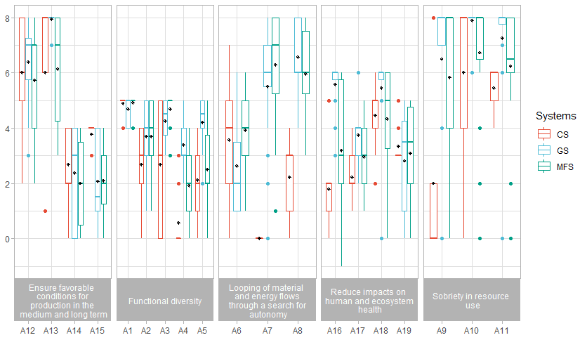
Hi, Here is my code bxp_5 <- cf %>% Here what R display Then I run my test : model_5 <- lm(Scores ~ Indicators * Systems, data = cf) pwc_5 <- cf %>% pwc_5 <- pwc_5 %>% add_xy_position(x = "Indicators") And here is what the R console says Error in check_aesthetics(): ! Aesthetics must be either length 1 or the same as the data (285): group, step.increase, bracket.nudge.y and bracket.shorten Backtrace:
Thank you a lot in advance for your countless help. I can provide the dataframe if needed. |
|
Does anyone know the method of multiple comparison procedure in stat_compare_means() - t-test? I used this for the graph; I need to write exactly what it is. |
I have the following plot and want to want to compare
HER2+totriple-negativefor each gene (41BB, CD8A, ...) using ggpubr's
stat_compare_means.In the end I want to have 6 p-values, one over each gene.
Is that possible currently with ggpubr? Otherwise I would highly appreciate that feature to be implemented.
What I tried:
+ stat_compare_means()which obviously compares all groups+ stat_compare_means(comparisons = list(c("HER2+", "triple-negative"))which fails withComputation failed in stat_signif(): missing value where TRUE/FALSE needed+ stat_compare_means(comparisons = list(c("HER2+", "triple-negative"), c("HER2+", "triple-negative"), c("HER2+", "triple-negative"), c("HER2+", "triple-negative"), c("HER2+", "triple-negative"), c("HER2+", "triple-negative")))which fails with the same error message.See also my question on stackoverflow
The text was updated successfully, but these errors were encountered: