
MME Studio: The Transformation
My Role:
UX/UI Designer
Project:
Web Portal Redesign
Responsibilities:
UX Design
UI Design
HTML/CSS
Presenting
Timeline:
Summer 2022 - 4 Month Internship
Overview
First Glance
MME Studio is a department portal for the Mechanical and Mechatronics Engineering (MME) department at the University of Waterloo. It’s used by students, faculty and administrators alike. It houses a teaching assistant (TA) hiring application and a space management database, with more applications to come in the future.
I used my skills to improve the user experience and interface design for the portal.

Design Process
Former MME Studio Interface


It was up to me to reimagine how MME users would interact with this portal, consider their best interests, and enhance the interface design.
Research
User-Centric Approach
I first sought out previous user feedback in order to learn their pain-points. I asked questions to familiarize myself with the most important tasks they complete, and how all of the pages correspond to these tasks. I utilized sitemaps to help me comprehend and redesign the flow for all users.
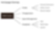
Target Users
Students
Professors
Administrators

Research Findings: Students
For the sake of this case study's length, I'm going to outline the portal improvements for the majority of users: students.

Problem Assessment
After empathizing with students and walking through the interface, I determined that I needed to focus on correcting the following issues:

Lack of consistent interface design
Poor page navigation
Unclear communication of hiring process
Design
1. Fresh New Look
After many iterations, I came up with a clean look that resembled the style of other webpages used by the university. Keeping it consistent with elements that students are already familiar with was appreciated by the administrator.


This new page ties together the Waterloo Engineering look with university branding and one of the faculty's buildings.

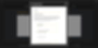
Log In

I reformatted the form layout so students can apply with ease, with a better use of screen space.
TA Application: Apply Now
2. Improved Navigation
A bit of renaming of elements and reorganizing of pages left the portal in a much better state, with a shallow learning curve and efficient navigating.


I promoted a more natural flow by adding a navigation bar with the profile, log out, help section, and bug report pages. This left the main area of the page clear for navigating to different applications.

Home Page
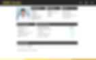
I merged all profile sections into one page to efficiently provide the user with their information, status and to upload their resume.

Student Profile
3. Improved Clarity
With added information and statuses about the hiring process, the concept became easier to grasp, and user tasks became more apparent.


I introduced an "Important Dates" section to outline deadlines that were previously not displayed. I also advocated for statuses and a task list.

TA Application: Dashboard
Implement
Coding Contribution
Once my designs had been approved, I began making the changes to the portal using HTML and CSS. I was introduced to the framework Bootstrap and was able to learn and work more efficiently. With my limited coding experience, I was able to provide the visual foundations of the interface, and simple elements such as navigation bars, input forms and buttons.
Results
A Success!
In the end, I received an “outstanding” on my evaluation, and was offered to come back for more work in the future. I was told that the new portal had “nothing but positive feedback” from users.
Having the opportunity to improve and add on to an existing application used by a whole department in my university was a rewarding experience that I’m very proud of myself for accomplishing.

Interactive Prototype
Press "R" to restart
Reflection
Constraints
All my designs had to be approved by the portal admin before implementation began, and they were not always available for meetings. This unfortunately delayed the progression of the project at times, but it always kept me ahead with time to explore alternate options for designs and features.
Being the first and only person with user experience and design skills on this project, I was often times left with minimal user feedback and information on target users to reference. I was also not required to conduct my own research. But I was able to use my intuition and came through with improvements.
Takeaways
I learned quickly that the portal admin wanted an overall improvement of the portal's interface, but they didn't want it to stray too far away from the original look. This challenged me to think in ways that I usually wouldn't, and I had to rationalize my decisions for certain changes. In other words, there had to be a balance of familiarity and improvement.
This was also my first time coding professionally and I found it to be a positive experience. I now have a clearer understanding on a developer’s responsibilities, so I’ll be able to better collaborate with them in future projects.