

Carissime
mele marce
Year:
2022
Categories:
Publisher:
Print & cover project:
Silkscreen, Laboratorio Zanna Dura
Inner book print:
Risograph, Press Press Milano
Exhibition:
Fruit Exhibition, september 2022, Bologna
Typeface:
BD Supper by Büro Destruct

Cassero LGBTI Center
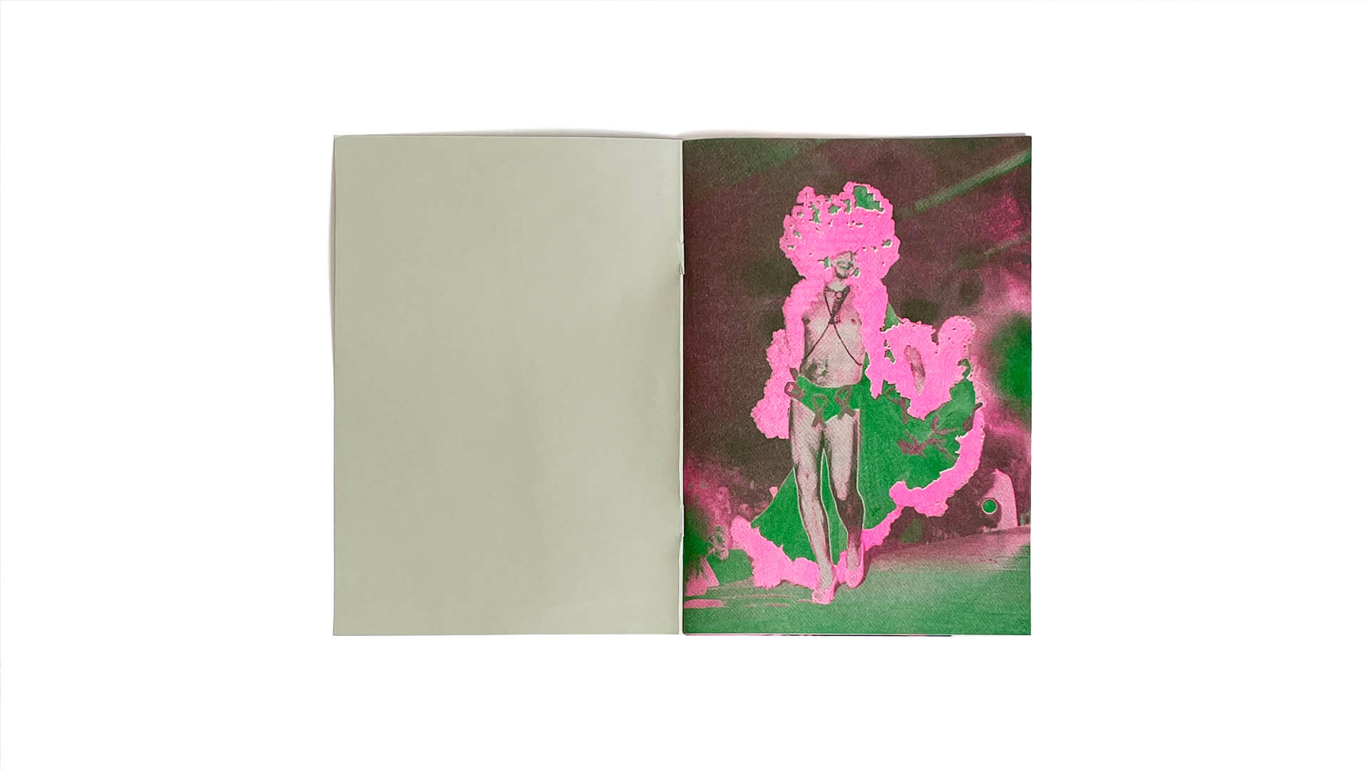
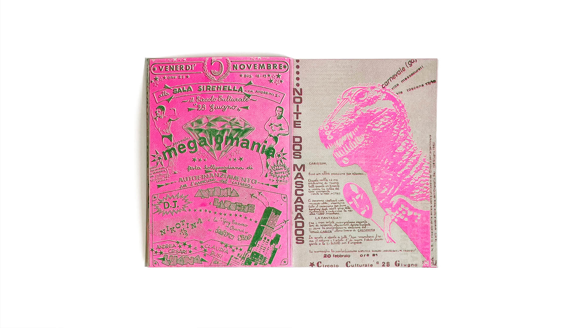
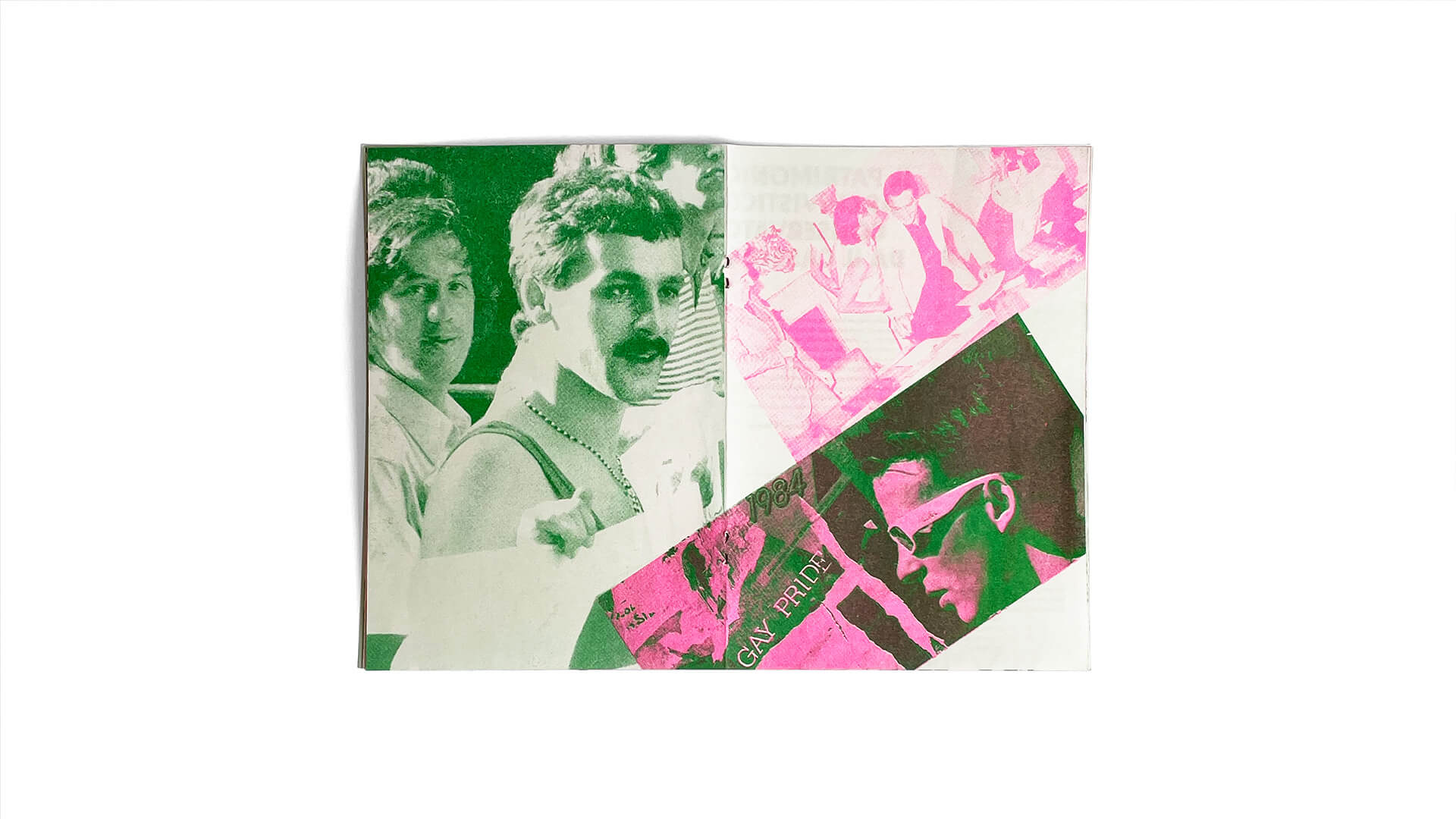
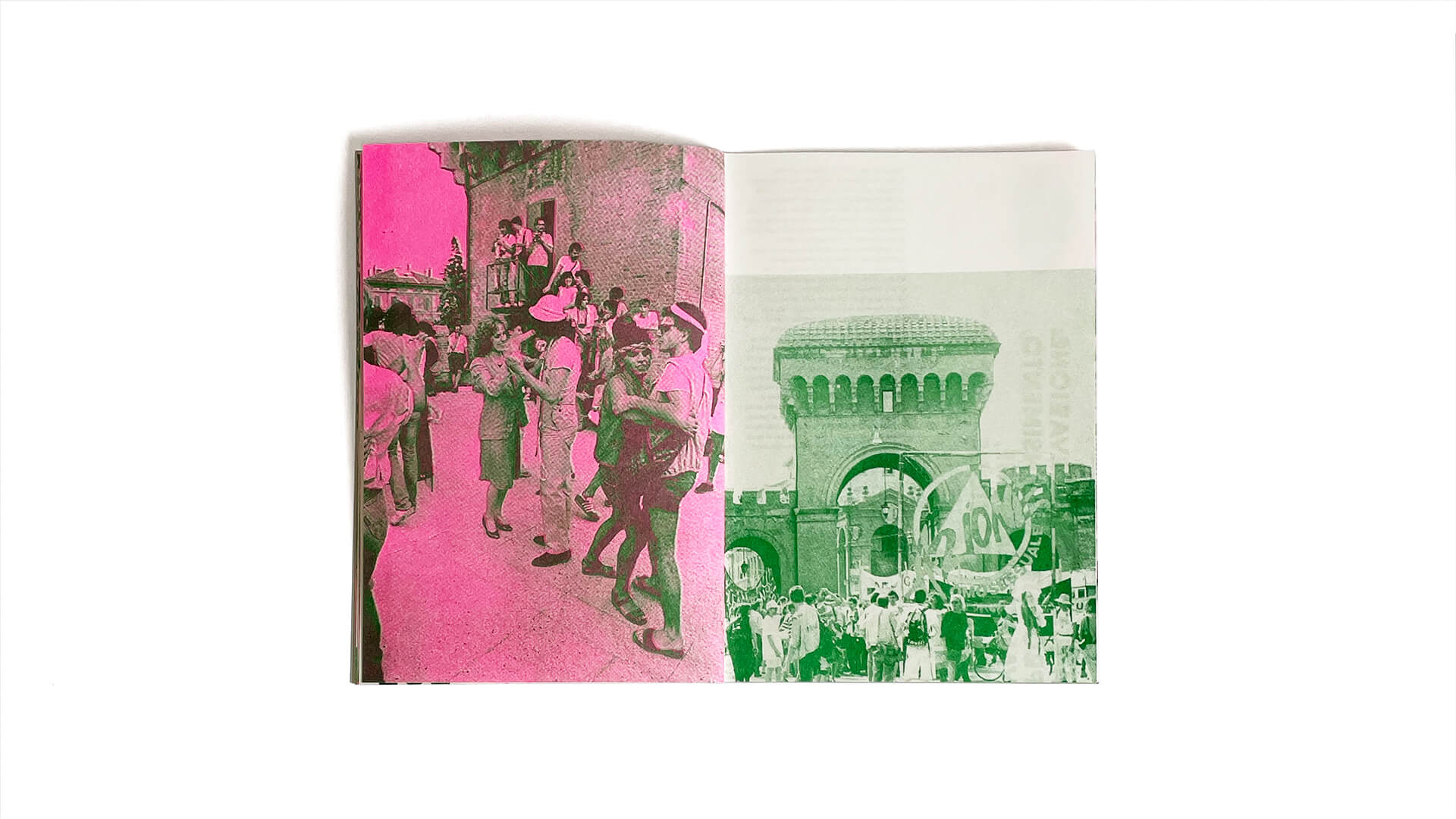
Carissime mele marce [dearest rotten apple] is a promotional fanzine made for the Centro di Documentazione Flavia Moraschi of the Cassero LGBTI Center in Bologna and edited by Promemoria Srl. The project was born to promote the activities of digitization of the archive of the center trying to enhance the images and the history of the center itself. The fanzine is divided into seven different chapters each enclosed in a single double page. These parts are interspersed with a second level narration of images aimed at giving value to the documents digitized by the LGTBI Cassero Center.


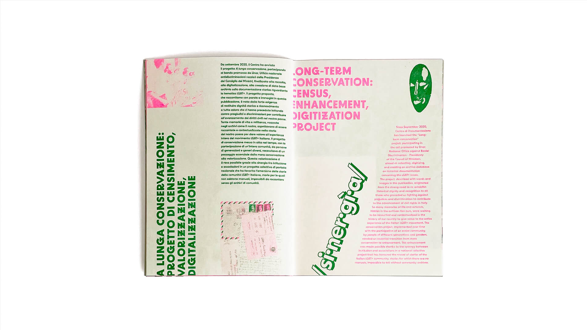
A queer design
The design reasons around the term “queer“, Anglo-Saxon word literally translatable as “strange” and “bizarre“, and the German word “quer” literally “diagonal“, “sideways“. So I designed the editorial grid of the inner pages to create a layout that could easily be modified to be fluid and unconventional. Each chapter, in fact, has its own specific graphic composition that differentiates it from the others. The use of the two colors and the font, which remain constant, continues to render the fanzine’s visual identity. Each element is recognizable, therefore, as part of a cohesive set, but they are freely rotated or placed within the page.


Printing
The cover of the fanzine Carissime mele marce has been designed and printed in silkscreen by Laboratorio Zanna Dura in Turin with the collaboration of Enea Brigatti, on behalf of Promemoria Group. The colors used for the cover differ from those of the interior and were chosen a gold color and a fluorescent green. However the interior was printed in risograph by Press Press in Milan. We chose to print with this technique in order to emphasize and embellish the contents, deliberately designed in two-tone FluoPink and Green. We have tried to highlight the peculiarities of the images in question, trying to bring out a queercore spirit. Both the printing methods used, screen printing and risograph, give a greater prestige to the elaborated.


Are you looking for something similar?
Would you like to know more about this project?
Feel free to write me an email ツ
All of the following fields are required.
Or write me directly from your email service