ArtSeen
AD REINHARDT: Blue Paintings
This presentation at David Zwirner Gallery is the largest exhibition of Ad Reinhardt’s blue paintings ever assembled, and the first dedicated to them since a seminal 1965 show at the Stable Gallery. It is comprised of twenty-eight paintings, spanning the 1940s and 1950s, but with an emphasis on the early part of the latter decade. Its immense value is that it allows us an unprecedented insight into the development of Reinhardt’s paintings more broadly. When he was painting them he never isolated the blue works as a single series—the Stable exhibition was the first time that he highlighted them—but rather always produced them alongside other paintings; whether the various types of works involving calligraphic, gestural, or blocked marks in the 1940s, or the red and black paintings he was also making in the early 1950s.
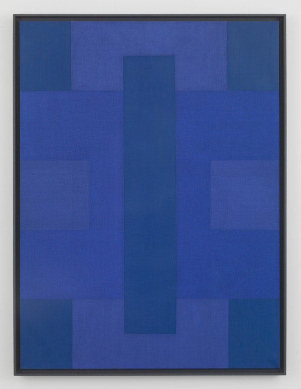
There is a marked diversity within the formal rigor that is on display in this sampling of twenty-eight paintings. In the first room of the exhibition we find the earlier works (along with some later ones for context), which quickly absolve us of the cliché of Reinhardt as a hard-edged, reductive, geometric painter. These may be assembled under the category of “blue paintings,” given the dominance of the color in each of their palettes, but in practice we are confronted with numerous variations on the theme, involving everything from loose brushwork to tight interlocking geometric planes, as well as a repertoire of blues that ranges from pale tones to dark ones approaching black. This is not to mention that we are also made aware that, as with the black paintings to come, no painting is ever truly monochrome, but is always built up out of varying shades of blue, and in certain paintings, especially early ones, they sometimes coexist with complementary, non-blue colors, most prominently in the large horizontal painting incorporating greens.
Perhaps most interestingly, in light of Reinhardt’s subsequent development, like the black paintings the blue paintings in their later, most rigorously reductive format adopt both the cruciform motif and the same array of primary colors—red, blue, and green, just here mixed with blue, instead of black, making magenta, cyan, and various shades of blue. That sometimes a painting only uses two shades of blue—say a magenta alongside a deeper, royal blue—shows that Reinhardt had not yet in the early 1950s created a system out of color, as he would later when the black paintings were fully underway, but nonetheless he had the idea that red, blue, and green mixed with a single color enabled him to achieve a high degree of coloristic complexity within a single hue, which he also employed for the contemporaneous red paintings, working with different red tones, but also mixing red with green and blue to juxtapose yellow and magenta passages with the red ones. Also in evidence is that Reinhardt was similarly already starting to drain out much of the oil from his pigments to achieve a matte surface that feels dense and substantial, without being thick or impastoed.
On View
David ZwirnerSeptember 12 – October 21, 2017
New York
As James Lawrence argues in a text accompanying the show, these blue paintings should not be seen as only a way station on the road to the “ultimate” black works. Certainly, for a time they were themselves the pinnacle of Reinhardt’s production, alongside the red paintings he was painting concurrently. Reinhardt himself with time came to see these paintings as compromised not because of any limitations internal to them, but rather because of outside factors. His decision to cease making blue and red paintings in 1954 was due to his realization that viewers reacted strongly to his color choices, feeling attracted to one color or another based on arbitrary preferences, ignoring the formal problematics Reinhardt was engaged with.
Most profoundly, perhaps, what they signal is his arrival at a certain formal innovation: the perceptually-oriented painting. This is to say a focused, meditative experience, whereby intense concentration was needed to activate the work, the effects of which unfolded in the viewer’s sensorium, rather than in the painting itself. His conscious development of this innovation is perhaps the biggest formal differentiator between the first blue paintings and the last ones. In the earlier works we typically register the geometric forms of the works first and then we parse the divisions between one form (and its corresponding tone) and another (with its). Following this, if we steady our gaze, taking in the entirety of the painted field as a relative totality, the divisions between forms gradually fade away as the painting darkens into a single, monochromatic plane of color. Reinhardt would dedicate the rest of his career to the exploration of these kinds of subtle optical effects, at David Zwirner we are able to discover the nuances that he had already developed at the outset of this career-defining achievement.
